Global Food & Beverage
Designing Operational Clarity for Store Teams
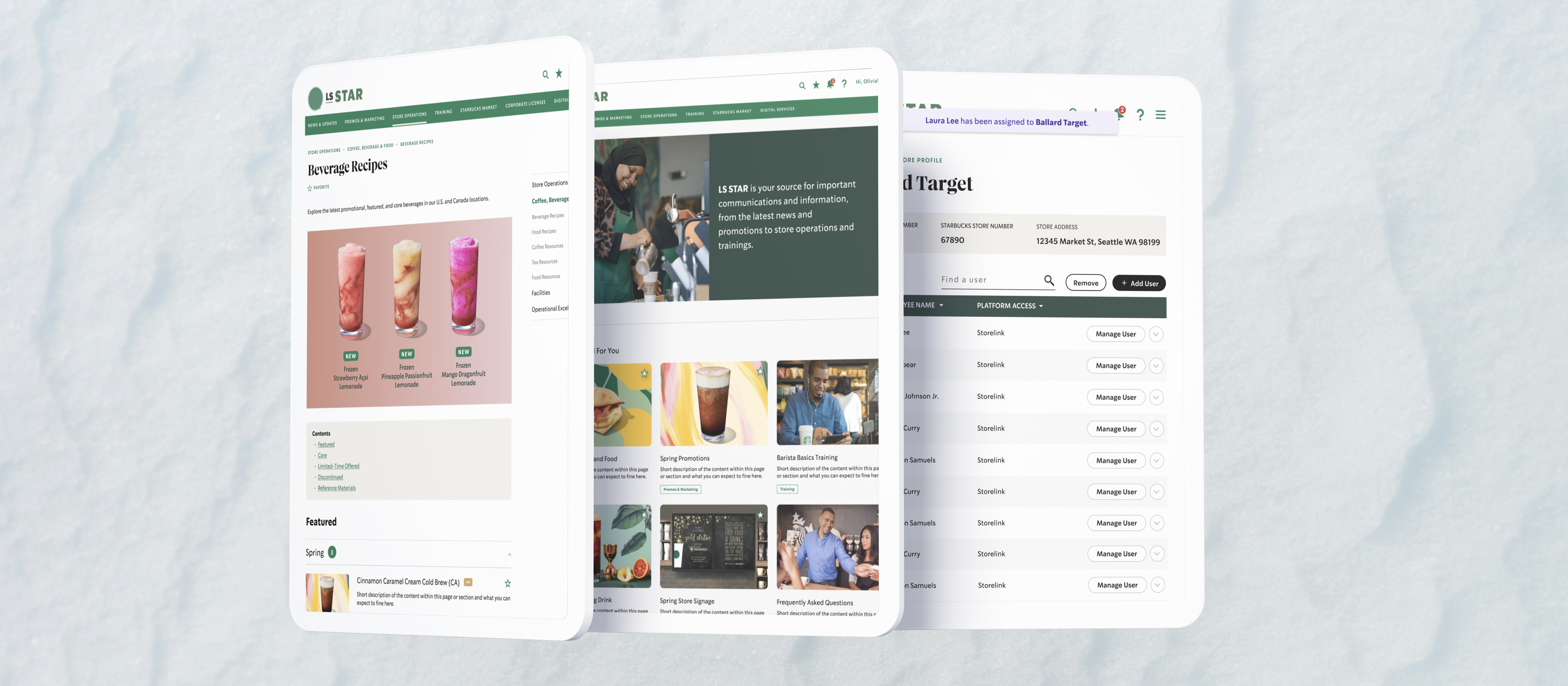
Helping 80,000+ retail workers find the updates, materials, and support they need
At stake
When navigation friction becomes operational drag
Licensed store employees and managers run locations in malls, airports, grocery chains, and other distributed retail environments while serving guests. They depend on an internal operational site for policy updates, store materials, support resources, and timely communications.
When the system drifts — unclear labels, weak findability, content grouped by legacy structure rather than store workflows — teams rely on bookmarks, outdated paths, repeat questions, and informal workarounds. At 80,000+ workers, small navigation friction becomes operational drag between the field and central support.
This work is not a cosmetic intranet refresh. It restructures how a Salesforce-based operations product helps frontline teams find role-relevant information fast — and how content authors maintain that structure without breaking it.
Scope & constraints
Role, research, and what shipped
As Senior UX Designer, I led information architecture restructuring, navigation and taxonomy design, and interaction patterns for the consolidated operational site — grounded in research with baristas, store managers, and district leaders (personas, journeys, and process flows).
In scope: IA and content grouping, navigation and exposed-menu patterns, role-relevant access, notifications and quick access, favorites and return paths, store communications (individual vs all-store views), and patterns that give content authors more control within Salesforce navigation constraints.
Stakeholders and users included store employees, store managers, district leaders, operational and content authors, and implementation partners on Salesforce. Constraints included fast-moving retail information, scale across 80,000+ distributed users, reducing bookmark and workaround dependence, and implementation tied to Salesforce content and navigation controls.
System snapshot
How operational information reaches the field
StoreLink functions as an operational information system between central operations and the field. Content authors publish into Salesforce structure; navigation, notifications, and favorites expose that structure to store roles who act on updates, materials, and communications.
- Content author → Salesforce structure (sections, taxonomies, role rules) → navigation / notifications / favorites → store role → store action.
- Store employees need day-of updates, materials, and support while on the floor; store managers need team-relevant information, sharing paths, and store-specific monitoring; district leaders need network visibility without drowning stores in noise.
- Content authors maintain navigation, group content, and target role-relevant updates within Salesforce-driven controls.
- Operational updates, store materials, notifications, favorites / saved content, and store communications (targeted vs all-store) are the core objects teams move through daily.
What I optimized for
Principles for clarity at scale
- 1. Make role-relevant information easier to find — navigation and grouping follow store mental models, not legacy content buckets.
- 2. Reduce dependence on bookmarks and workarounds — expose content before users commit to a path; strengthen return paths for high-frequency references.
- 3. Close the gap between “something changed” and “I can act” — notifications and quick access for timely operational updates.
- 4. Separate signal from noise at scale — individual and store-targeted communications vs broader all-store visibility when the network view matters.
- 5. Give authors control without IA chaos — Salesforce-friendly patterns so authors maintain navigation and role-relevant content within structure.
Decision 1
Rebuild IA around how store teams actually work
What changed: Labels, content grouping, and navigation hierarchy shifted away from inherited internal buckets and toward store workflows and employee mental models.
Why it mattered: When structure does not match day-of work, every task starts with hunting — managers and store employees pay the cost during service.
What constrained it: Salesforce content structure and existing material had to migrate without losing critical paths authors already maintained.
Decision 2
Expose section content before users dive in
What changed: Exposed navigation lets employees scan section content at a glance before choosing a destination — scan-before-click instead of committing to the wrong path.
Why it mattered: Reduces wrong turns and repeated back-navigation for users who do not live in the tool daily.
What constrained it: Density vs scanability on smaller viewports; patterns had to work within Salesforce navigation behavior.
Decision 3
Create faster return paths for recurring references
What changed: Favorites and clearer high-frequency entry points on role-oriented home surfaces replace informal bookmarking for recurring operational references.
Why it mattered: Teams already used bookmarks as a coping mechanism; the product should support legitimate repeat access without hacks.
What constrained it: Favorites had to stay manageable at scale — not become a second broken taxonomy.
Decision 4
Make updates and notifications easier to act on
What changed: Centralized notifications and quick-access paths connect “something changed” to detail and action without hunting across sections.
Why it mattered: Operational updates only help if stores see them and can respond while running the location.
What constrained it: Update volume and variety; UI had to prioritize timeliness without hiding historical context.
Decision 5
Separate role-relevant communication from all-store visibility
What changed: Targeted and individually relevant communications sit alongside an all-store view when broader network context is needed.
Why it mattered: District and store roles need different lenses — noise for one role is essential for another.
What constrained it: Permissions and authoring rules had to stay clear for authors publishing at different scopes.
Decision 6
Give content authors more control without losing structure
What changed: Patterns let authors adjust navigation and role-relevant content within Salesforce guardrails — maintaining wayfinding while tuning what each role sees.
Why it mattered: IA that cannot be maintained drifts back to confusion; authors are the long-term owners of findability.
What constrained it: Flexibility for authors vs consistent navigation for 80,000+ users — structure had to hold as content changed.
Results
What changed
- · Supported 80,000+ retail workers using a consolidated system for support, updates, and store materials.
- · Aligned navigation to store workflows and employee mental models through research with baristas, store managers, and district leaders.
- · Reduced reliance on bookmarks and informal workarounds by making content easier to scan and find.
- · Gave content authors more control to maintain navigation and role-relevant content within Salesforce structure.
- · Helped store managers share information and monitor store-specific content more clearly.
The consolidated experience replaces a fragmented operational site with IA and interaction patterns aligned to how distributed stores run — so frontline teams spend less time fighting the tool and more time serving guests.
Next
What I'd push further
Role-based personalization beyond static role surfaces — default landing tuned to frequency and location context.
Search analytics and zero-result tracking to see what 80,000+ users still cannot find after IA improvements.
Content governance for Salesforce authors — templates, naming rules, and review cues so flexibility does not erode structure.
Notification prioritization logic — what must interrupt vs what can wait when update volume spikes.
Feedback loops from stores — lightweight signals when teams cannot find what they need, tied to content owners.
Bookmark and failure analysis — which pages are saved repeatedly or abandoned mid-path, to target the next IA iteration.
