Fortune 200 Consumer Products Company
Enterprise Knowledge Assistant
Empowering employees to access enterprise-wide knowledge and application data through natural language
At Stake
In the fall of 2023, many organizations were implementing the Enterprise GPT tool from OpenAI. This was a way to get started with AI in the enterprise, but it was not the connected assistant employees were hoping it would be.
In large organizations, the information people need is scattered across the tools where work happens.
Teams, OneDrive, intranets, PDFs, ticketing systems, design files, data platforms, and project documentation each hold part of the picture. Employees are left to connect the dots: what is current, what is relevant, who owns it, and what should happen next.
This work explores a bigger question than “what if employees could chat with company knowledge?” What if an internal assistant could connect across the tools where work already lives—bringing together sources, context, and next actions inside one context-aware shell?
The assistant cannot behave like a black box. Its value comes from showing what it found, where it came from, and how the employee can move forward with confidence.
Scope & Constraints
I lead interaction design and IA for a fast exploratory concept (~10 weeks) with internal stakeholders across platform teams, knowledge owners (including policy/HR-adjacent content), and enterprise governance partners.
- Trust + governance: answers needed visible grounding (sources, citations, links)
- Mixed internal content: policies, HR references, internal files, links, and training/video
- Emerging AI patterns: few established conventions for enterprise-ready output UX
- The UI needed to scale beyond “chat” without becoming a control panel
What I optimized for
- 1. Actionable over conversational. The assistant is a work surface, not a transcript.
- 2. Trust through visible sources. Show what the answer is based on.
- 3. Context beside the answer. Put supporting material where decisions happen.
- 4. Progressive disclosure. Keep the core flow simple; reveal depth when needed.
- 5. A flexible shell for emerging AI patterns. Design for change without churn.
System Snapshot
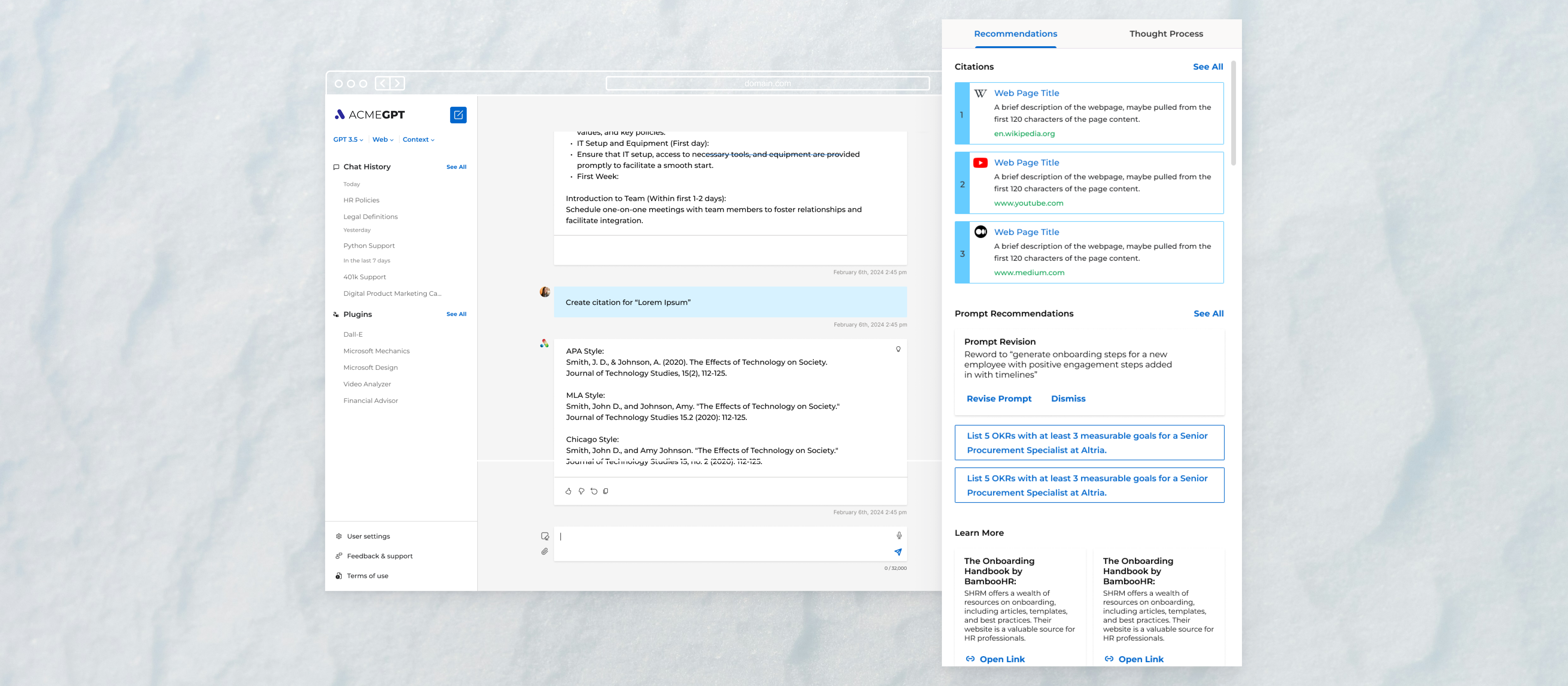
Ask → retrieve context → respond + cite → act
The interaction model stays simple: ask → retrieve context → generate a response → verify with sources → take action.
The dynamic pane is the core concept. It keeps citations, internal files, HR/policy references, links, training/video content, and suggested next actions beside the answer—so the assistant is more useful than a chat-only transcript.
Key Decisions
Designing for trust, context, and follow-through
Decision 1: Design the assistant as a context-aware shell, not a chatbot screen. What changed: a stable shell with a dynamic pane, not a transcript-first UI. Why it mattered: enterprise usefulness depends on “verify, then act.” Constraint: fragmented systems and governance needs.
Decision 2: Pair responses with sources and supporting material. What changed: the answer ships with citations, links, and relevant internal material. Why it mattered: trust improves when the system shows its footing. Constraint: content freshness and ownership are uneven.
Decision 3: Treat next actions as part of the answer. What changed: the UI suggests follow-through actions (open a source, share, export, refine). Why it mattered: most work starts after the response. Constraint: employees need momentum, not another place to read.
Decision 4: Support follow-up questions without losing context. What changed: the pane and conversation evolve together so the user can iterate without restating everything. Why it mattered: enterprise questions are rarely one-and-done. Constraint: context loss creates rework and doubt.
Decision 5: Create a layout system that could evolve as AI capabilities changed. What changed: a reusable shell and component language built for iteration. Why it mattered: early AI patterns shift quickly. Constraint: uncertain roadmap and a short exploratory window.
Results
- · Defined a context-aware interaction model for enterprise AI output, pairing responses with sources, supporting material, and next actions
- · Helped stakeholders evaluate AI through concrete product patterns instead of abstract ideas
- · Created a reusable assistant shell that could support future internal knowledge workflows and integrations
- · The product launches and is adopted internally within 6 months
- · About a year later, the client returns to explore a 3.0 follow-up; the work does not proceed due to layoffs
The work turns an early enterprise AI idea into a real internal tool: a context-aware assistant shell that helps employees retrieve, verify, and act—without asking them to trust a black box.
What I’d push further
I’d push the concept further by defining how the assistant communicates confidence, handles restricted sources, and shifts between task modes—so the interface adapts without asking employees to understand the system behind it.
