Multi-Generational Family Office
Modernizing the Family Office
Creating a clearer digital layer for sensitive information, service outreach, and day-to-day coordination
At stake
Why lift-and-shift was the wrong move
Family office clients are not using a lightweight account view. They move across sensitive updates, documents, people, service touchpoints, and outbound communication — often with little patience for ambiguity.
The engagement began as a CMS and client portal migration. The risk was lift-and-shift: moving dated hierarchy, unclear navigation, weak brand expression, and limited functionality into a new system would have preserved the wrong problems. It would also undercut how families and staff actually coordinate day to day.
As the work progressed, the effort expanded into a broader redesign, rebrand, and functionality update. The real work became reconnecting identity, information architecture, and interaction so the digital layer stays credible, discreet, and legible in a high-trust environment.
Scope & constraints
Role, partners, and what shipped
As Senior UX Designer, I led information architecture, design system direction, and responsive UI patterns for the signed-in family office portal — from strategy artifacts through templates for home, contacts, client outreach, and family news.
Partners included creative direction and engineering, with implementation targeting Adobe Experience Manager (AEM). HubSpot sat in the broader client communication landscape; the portal work stayed focused on clarity inside the signed-in experience.
Constraints included a migration timeline that later had to absorb redesign and added functionality, brand modernization without drifting into cold “corporate SaaS” defaults, and privacy and discretion as non-negotiables — layout and copy had to signal trust, not noise.
System snapshot
What the portal has to hold together
The portal functions as a service layer between households and internal staff: it carries institutional updates, a contacts model, discreet client outreach, and family news — all of which need predictable structure and editorial repeatability.
- Clients / families use the signed-in experience to see what matters next, open documents, and follow institutional updates.
- Staff and advisors rely on the same structures to coordinate service, surface contacts and roles, and send intentional outbound messages.
- Documents, requests, and “what happens next” have to stay legible without collapsing into a single undifferentiated feed.
- Family news needs a distinct browse vs read rhythm so editorial content stays credible next to transactional tools.
- AEM-ready components connect UI craft to how editorial teams will maintain and extend the portal over time.
What I optimized for
Principles for a high-trust experience
- 1. Build trust through clear hierarchy — calm surfaces, legible type, and predictable structure for sensitive work.
- 2. Make complex information navigable — IA aligned to tasks and relationships, not only inherited internal organization.
- 3. Reduce ambiguity around next steps — entry points and summaries answer “what do I do now?” without crowding the page.
- 4. Support clients and staff with one coherent model — directory, outreach, and news share repeatable patterns.
- 5. Modernize without cold corporate defaults — warmth and heritage stay visible in typography, color, and components.
Decision 1
Reframe the work from migration to modernization
What changed: Early alignment shifted from “move the site” to “fix what made the old portal feel dated and hard to trust” — hierarchy, navigation, brand, and gaps in functionality. Mood boards and sample components helped stakeholders agree on direction before locking full templates.
Why it mattered: A migration alone would have left families and staff with the same coordination friction inside a new CMS. The product needed to feel like the institution again — competent, discreet, and current.
What constrained it: Timeline pressure from the migration path; any expansion still had to stay implementable in AEM and credible for a multi-generational family office audience.
Decision 2
Rebuild IA around what families and staff actually do
What changed: Site structure and navigation were modeled around real tasks and relationships — how people find documents, contacts, updates, and outreach — instead of mirroring internal org charts alone.
Why it mattered: Findability is a trust problem in this context. When users cannot locate materials or understand where they are in the system, the service relationship feels weaker even when the team behind it is strong.
What constrained it: The structure still had to map cleanly to AEM authoring and sustainable templates, not one-off pages.
Decision 3
Tie brand expression to a repeatable system
What changed: A style guide and component vocabulary tied typography, color, and layout patterns to AEM-ready building blocks so brand expression scaled without one-off screens.
Why it mattered: Editorial teams need to evolve content without breaking visual trust; engineering needs predictable components to ship new sections.
What constrained it: The system had to feel warm and institutional — not a cold SaaS dashboard — while staying implementable and maintainable.
Decision 4
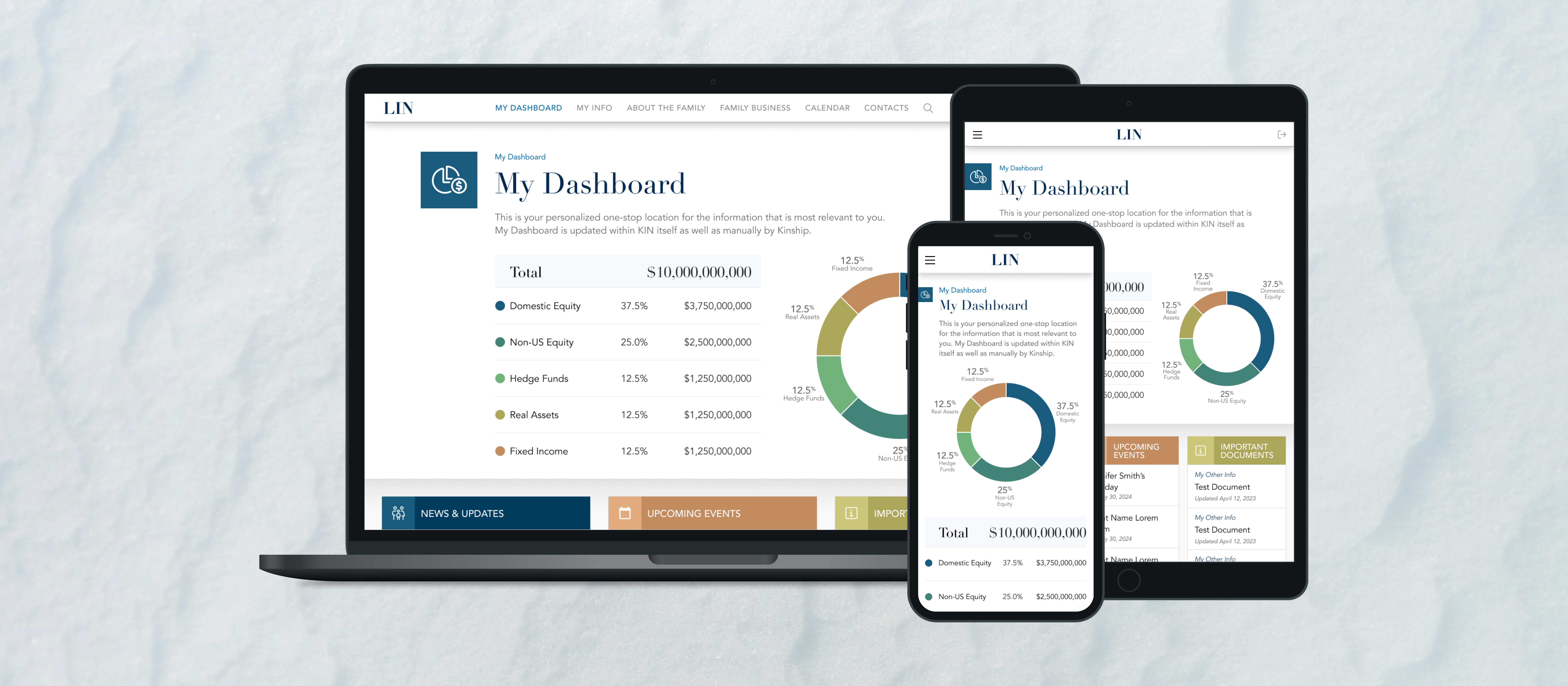
Design a home that states what matters next
What changed: The signed-in home prioritizes updates, shortcuts, and entry points so clients and staff see a calm summary of what deserves attention first.
Why it mattered: Reducing “where do I start?” lowers cognitive load in a sensitive context and supports faster coordination between families and staff.
What constrained it: Density had to stay legible on large canvases while the same information stayed scannable on a phone — without three redundant breakpoint galleries. Desktop shows hierarchy zones; mobile shows the same priorities in a stacked, glanceable order (tablet follows the same logic at mid-width).
Decision 5
Clarify people, roles, and discreet client communication
What changed: Contacts patterns give families and staff a single directory model with list and detail views that preserve role cues. The client outreach flow keeps context visible for review before anything is sent.
Why it mattered: Wrong contact paths or sloppy outbound messaging erode discretion — a core requirement in family office service.
What constrained it: Responsive layouts had to keep hierarchy and trust cues without repeating three near-identical device shots; desktop + mobile pairs carry the decision for each flow (mid-width layouts follow the same spacing and type scale).
Decision 6
Give family news a clear browse vs read model
What changed: Editorial content uses a dedicated landing pattern for scan-first browsing, separate from article templates that protect line length, imagery, and reading hierarchy.
Why it mattered: Institutional updates need a credible editorial layer next to transactional tools; mixing browse and read into one undifferentiated pattern would weaken both.
What constrained it: The same stories have to read well on large screens and stack cleanly on small screens without losing structure — browse vs read stays explicit in layout, not only in copy.
Results
What changed
- ↑ The engagement expanded beyond the original migration into redesign, rebrand, and added functionality for the client-facing portal.
- ↑ Portal structure and navigation align more closely to how families and staff navigate documents, people, updates, and outreach.
- ↑ AEM-ready templates and components give editorial and engineering teams repeatable patterns for new content and sections.
- ↑ Responsive patterns preserve hierarchy and scan order across primary breakpoints without reading as generic shrink-to-fit grids.
- ↑ The experience reads as more modern while staying appropriate for a high-trust family office context.
The trigger was a CMS migration; the outcome is a clearer, more trustworthy digital layer — identity, IA, and templates aligned so sensitive, high-touch service stays legible as the portal grows.
Next
What I'd push further
Next iteration could push role-based views and clearer permission grammar where the platform allows it — especially where clients and staff see different slices of the same household story.
I would also explore cross-surface status for requests and documents, and quieter notification defaults that match family office discretion.
A more explicit model of households, advisors, and service teams would help when relationships are complex — surfaced in IA and UI, not only in training.
