Leading Cruise Line
Hiring Readiness at Global Scale
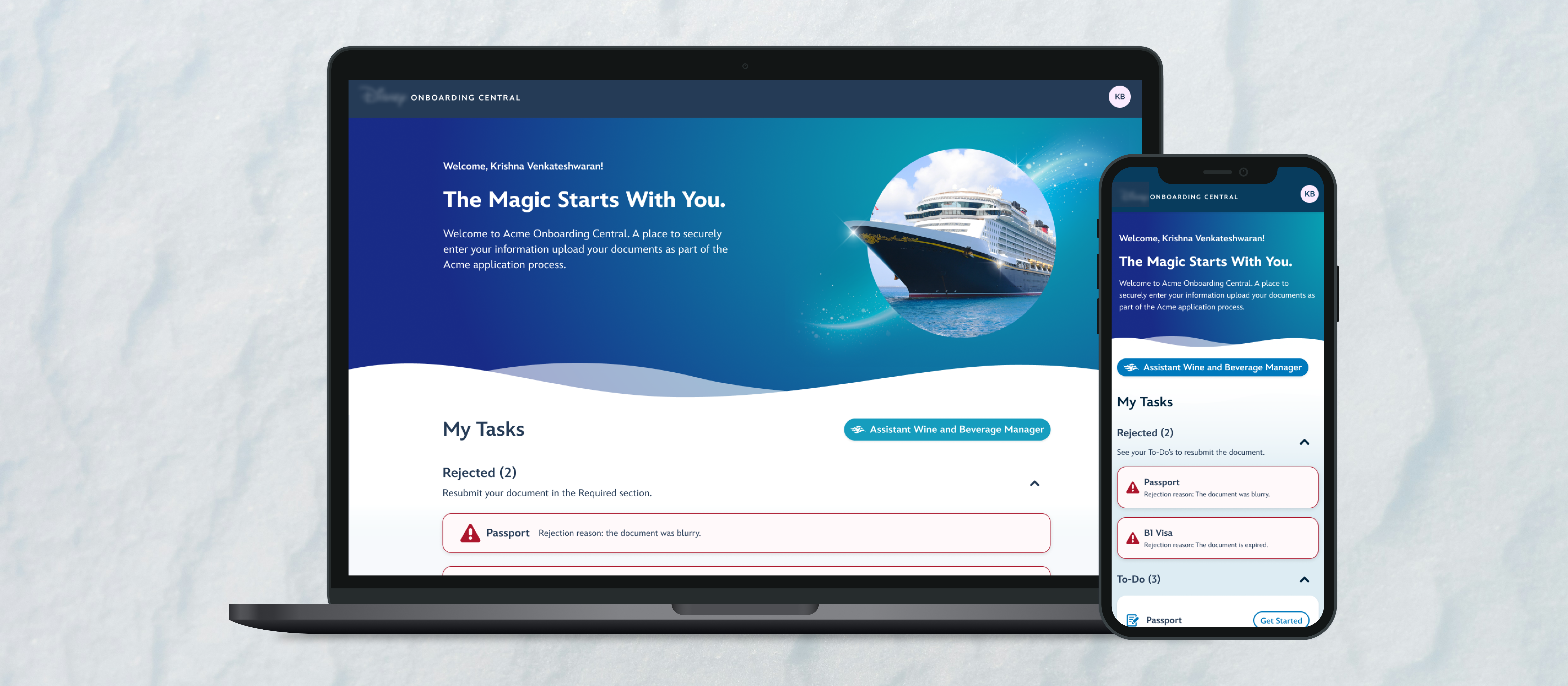
Helping candidates and recruiters move through documentation, clearance, and embarkation
At stake
Why hiring readiness is an operational system, not a form
Cruise hiring is not submitting an application and waiting for a call. Candidates must move through interviews, passport and visa uploads, language proficiency exams, medical documentation, contract signing, task tracking, and final embarkation readiness — often across months, regions, and contract cycles.
Recruiters need to know who is ready, who is blocked, and what needs attention across high-volume queues. Employees may return to the same system for multiple contracts and roles. When the experience is dated or fragmented, confusion becomes missed deadlines, missed contracts, extra support load, and operational risk.
The work reframes a global hiring platform as a readiness system: visible states, predictable patterns, and next steps that hold up across continents, languages, varying digital literacy, unreliable connectivity, and shared-device use. Employer brand still matters — but it supports operational clarity rather than replacing it.
Scope & constraints
Role, stakeholders, and global workforce realities
As Senior UX Designer, I led a UX audit and pattern analysis, information architecture restructuring, end-to-end flow redesign, design system alignment, and usability validation across a multi-phase program.
Stakeholders included product and engineering, recruitment operations, front-end users (candidates and crew), and brand/design leads. The platform had to serve a globally distributed workforce while recruiters managed bulk workflows without losing accuracy.
Constraints shaped every decision: document-heavy compliance steps, mobile and shared-device access, localization-friendly layouts, and the need to modernize tone without hiding what is required vs optional or when something is due.
System snapshot
How candidates and recruiters move through the pipeline
The product carries two intertwined workflows — candidate readiness from application through embarkation, and recruiter operations across regions and deadlines.
- Candidate path: application follow-up → interviews and requirements → passport/visa, language exams, and medical clearance → contract signing → task tracking → embarkation readiness.
- Recruiter path: candidate queue → status and blockers → review and follow-up → readiness management at volume.
- Returning employees re-enter the same system across contracts; the experience must stay legible when requirements differ by role or region.
- Users span continents, languages, digital literacy levels, internet reliability, and shared devices — ambiguity in labels or state amplifies every failure.
- Recruiters need scan-friendly visibility, bulk management, and fewer back-and-forth cycles; confusion can mean missed deadlines or missed contracts.
What I optimized for
Principles for clarity at global scale
- 1. Make readiness visible — what is complete, in progress, blocked, or at risk before embarkation day.
- 2. Reduce ambiguity around next steps — candidates and recruiters should not have to interpret dense pages to know what matters now.
- 3. Support high-volume recruiter workflows with clearer status, queues, and follow-up without sacrificing truth.
- 4. Design for global access and varying digital fluency — mobile-first paths, plain language, and layouts that localize cleanly.
- 5. Bring employer brand into operational tools without sacrificing compliance clarity or scan order under stress.
Decision 1
Reframe the journey around embarkation readiness, not application completion
What changed: Information architecture and entry points organize work around readiness milestones — from application follow-up through final embarkation — instead of treating “submitted” as the finish line.
Why it mattered: Candidates and recruiters coordinate on the same long pipeline. When the product reads like a one-time application form, required work hides in secondary screens and support volume spikes near deadlines.
What constrained it: The underlying compliance steps could not be simplified away; the UX had to make the full journey legible without collapsing legal and operational requirements.
Dual journey — candidate requirements and recruiter queue share one readiness spine.
Decision 2
Make requirements and next steps visible
What changed: Dashboard-style overviews use grouping, progress, and explicit next actions so required vs optional work and due timing are obvious without opening every record.
Why it mattered: Missed steps and late documents drive recruiter outreach and candidate anxiety. Visibility reduces “what do I do next?” in the most time-sensitive part of the journey.
What constrained it: High information density had to compress into scannable hierarchy — not another wall of fields pretending to be a summary.
Decision 3
Support recruiter workflows with clearer status and candidate queues
What changed: Recruiter surfaces emphasize status at a glance, collapsed detail where appropriate, and structure aligned to the candidate-side readiness model.
Why it mattered: Recruiters operate across many candidates, regions, and deadlines. Speed without reliable state creates repeated questions, handoffs, and support tickets.
What constrained it: Views had to stay calm at volume — enough signal to act, not decorative density that slows scanning.
Decision 4
Modernize dense forms and document uploads into focused flows
What changed: Visa, medical, and other document steps use focused flows with clear requirements, validation feedback, and mobile paths treated as first-class — not shrink-wrapped desktop forms.
Why it mattered: Upload errors and missing requirements create rework, delays, and recruiter support load where mistakes are costly and connectivity is uneven.
What constrained it: Compliance rules still govern what can be accepted; the UX had to make rules legible without turning every step into a multi-purpose page.
Decision 5
Align the employee experience with the company’s premium guest brand
What changed: Typography, spacing, and microcopy shift from bureaucratic utility to a coherent employer experience — with consistent patterns so modernization reads as system-level change, not isolated screens.
Why it mattered: Internal hiring tools signal who the company is to future crew. Brand expression had to feel premium without weakening compliance clarity or operational scan order.
What constrained it: This remains a compliance-shaped operational product; visual polish could not trade away legibility of required work or recruiter truth.
System-level modernization — from fragmented legacy patterns to a single coherent readiness experience.
Results
What changed
- ↓ 30–40% reduction in recruiter support inquiries related to document confusion
- ↑ ~25% faster average task completion time during onboarding
- ↑ ~20% improvement in candidate task completion rates before deadline
- ↑ Higher internal usability scores post-launch
- ↑ Stronger alignment between internal hiring tools and employer brand
“This finally feels like us.”
Outcomes showed up in fewer support escalations, faster completion, and higher clarity scores. Recruiters and candidates spent less time interpreting the system and more time completing the work required before embarkation.
Next
What I'd push further
Next pass: a stronger status and blocker model — explicit at-risk states, exception handling, and bulk actions for recruiters when edge cases spike during high-volume cycles.
Localization and language support deserve deeper investment given the global workforce; analytics on drop-off and document errors would help prioritize where confusion still costs contracts.
Recruiter queue prioritization and clearer handoff into onboard operational systems would close the loop between “ready to embark” and day-one crew operations.
